
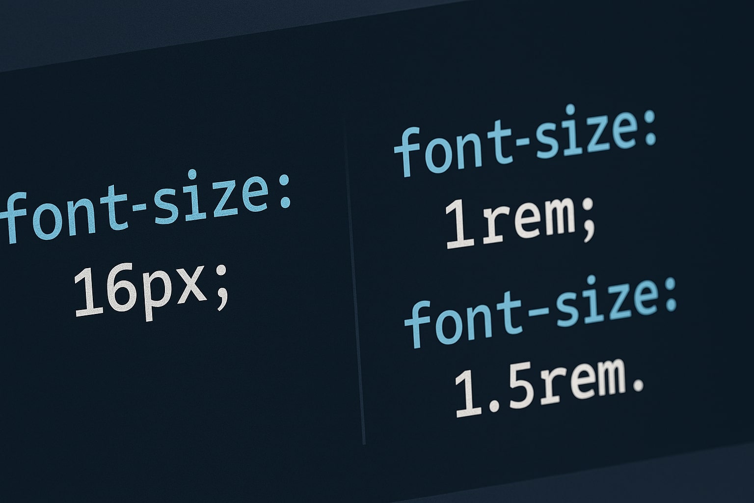
If you learned CSS years ago, you probably default to using Pixels (px). But in modern web development, using pixels for typography is considered bad practice. The industry standard has shifted to REM (Root EM).
The Accessibility Problem with Pixels
Pixels are an "Absolute Unit." If a visually impaired user sets their browser font size to "Large" (24px):
- If you use REM: Your text scales up automatically, respecting their settings.
- If you use PX: Your text ignores their setting and stays small. This is an accessibility failure.
What is REM?
REM stands for "Root EM." It is a relative unit based on the root font size (usually 16px).
1rem= 16px (Default)2rem= 32px
If the user changes their browser base size, 1rem adjusts automatically.
The Math Problem
Converting "24px" to REM requires math (24 / 16 = 1.5). Trying to calculate "14px" (0.875rem) breaks your flow.
The Solution: Use a Converter
Keep our CSS Unit Converter open while you code. Type your pixel value, and get the REM equivalent instantly.
When to Still Use Pixels?
Pixels are still perfect for things that shouldn't scale, such as borders (1px solid) or fixed-size icons.
Summary
In 2026, building accessible websites is mandatory. Use REM for font sizes and PX for borders. Happy coding!